WHAT’S IT LIKE INSIDE VIVO LATINO?
Choosing an aesthetic for a business can be overwhelming – there are a lot of restaurant design and decor ideas out there! As we've opened our Vivo Latino restaurant, we faced many decisions: from choosing our restaurant POS to carefully creating an adequate flow for our customers. Designing our restaurant was a significant step to creating a unique experience. And picking a theme that reflects our brand and incorporates our menu was much fun but, at the same time, a real challenge.
Here is the insight into what it took for the Vivo Latino to turn into what it is today and continue to evolve to improve the experience.
1 - Functionality is Key
The function can be far less fun to implement than design, but a well-functioning restaurant can significantly impact the bottom line. Hiring a professional designer to plan our layout and maximise function was a key to making our space no to feel crowded or cramped!
2 - Embracing the Classics
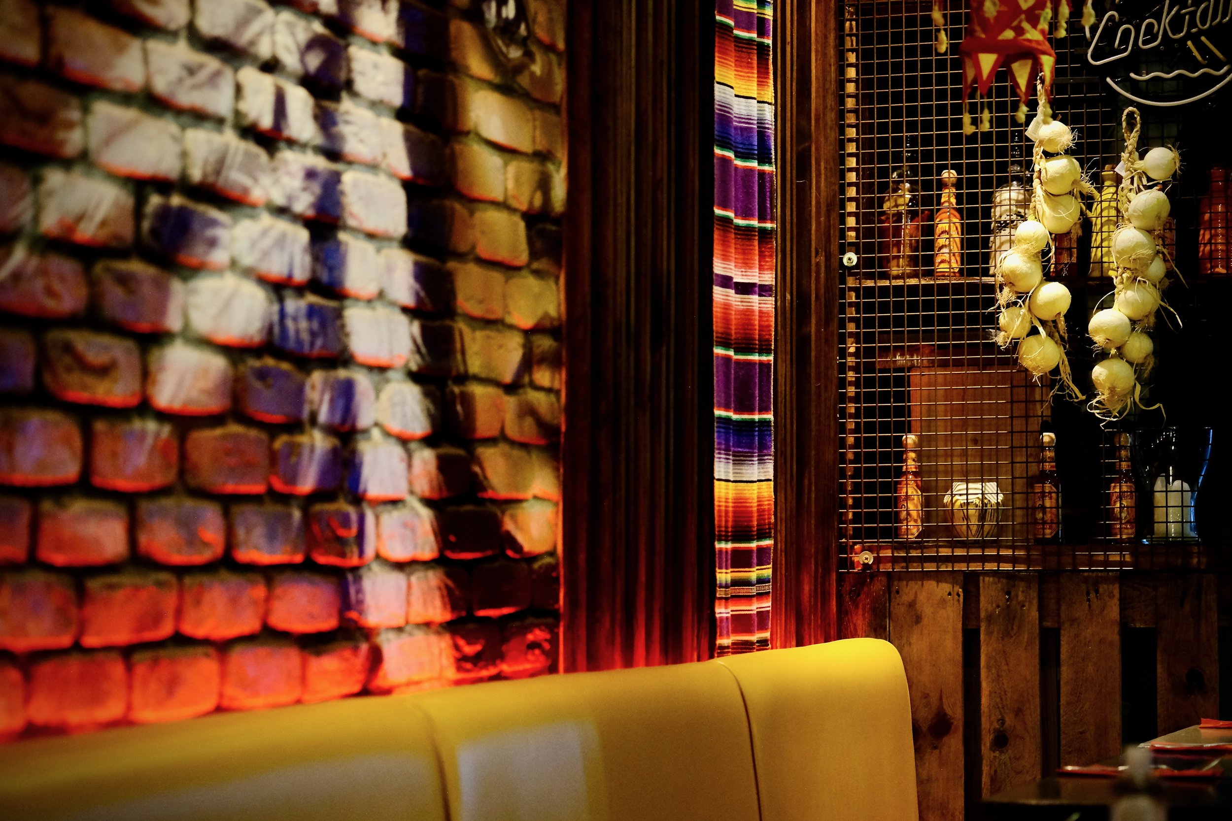
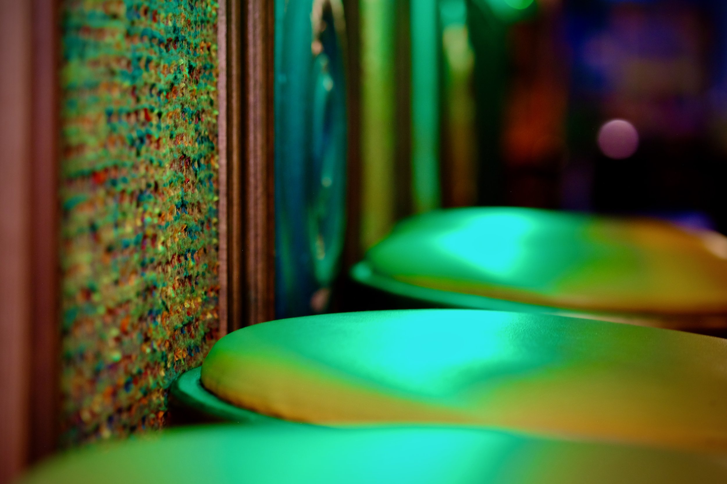
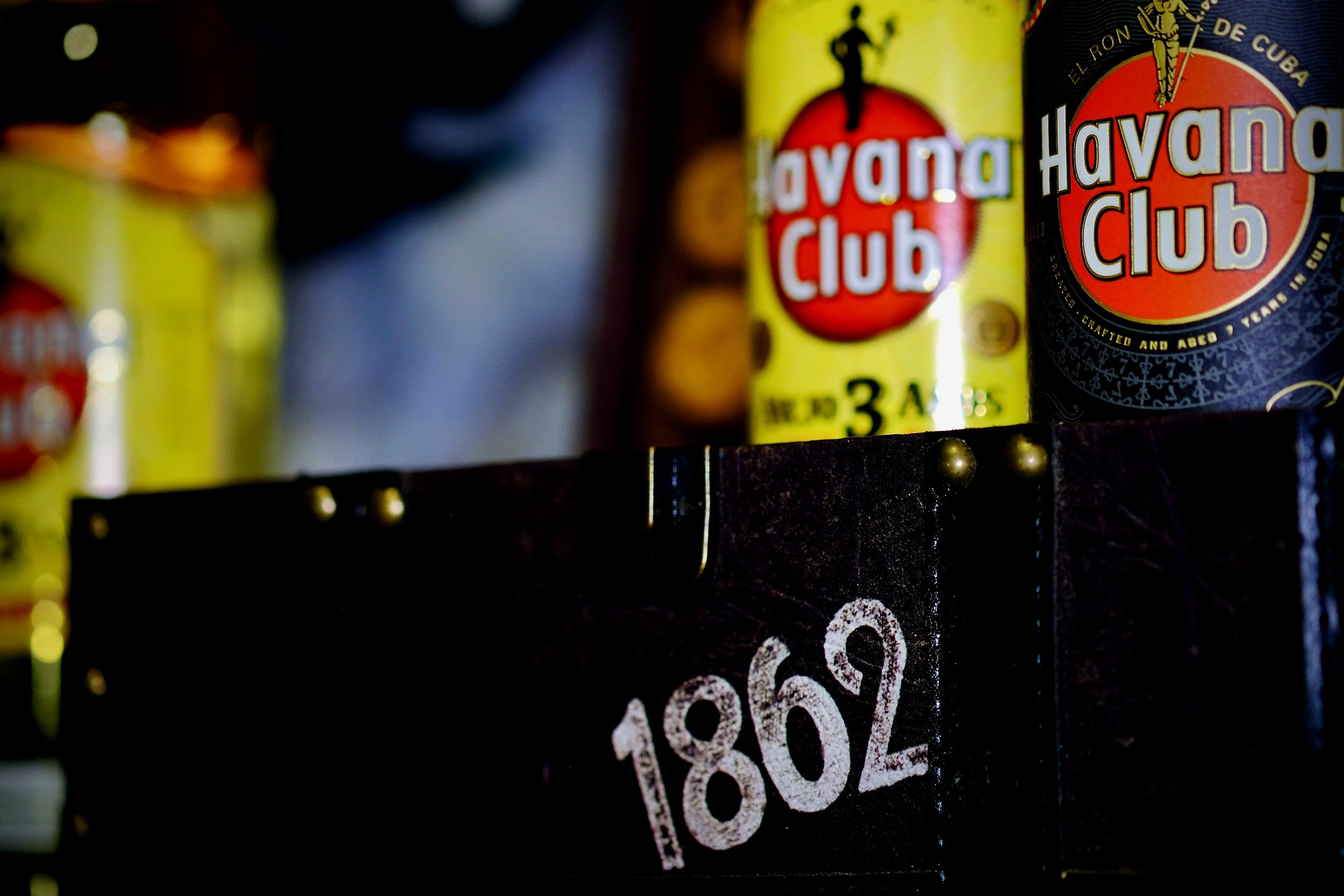
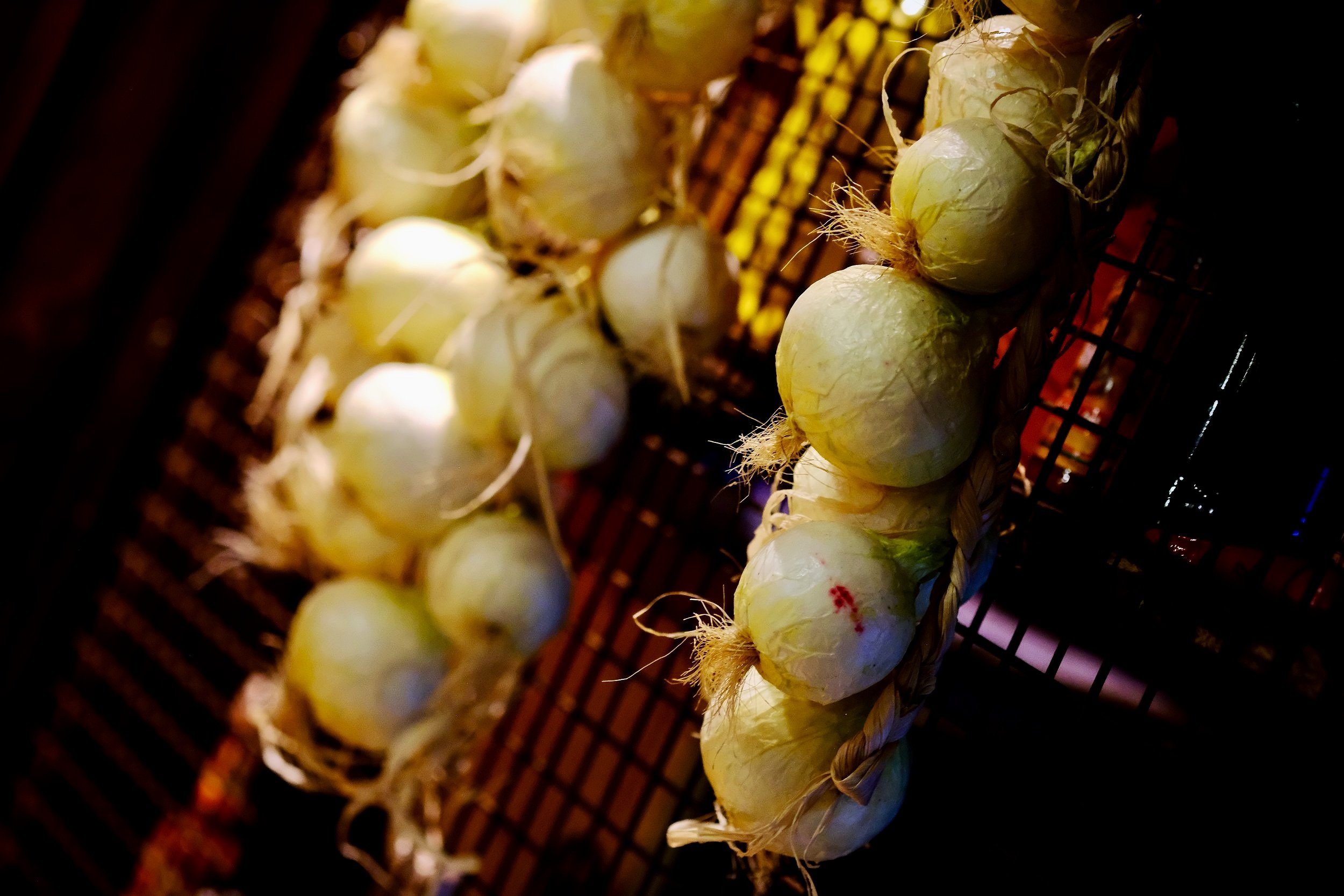
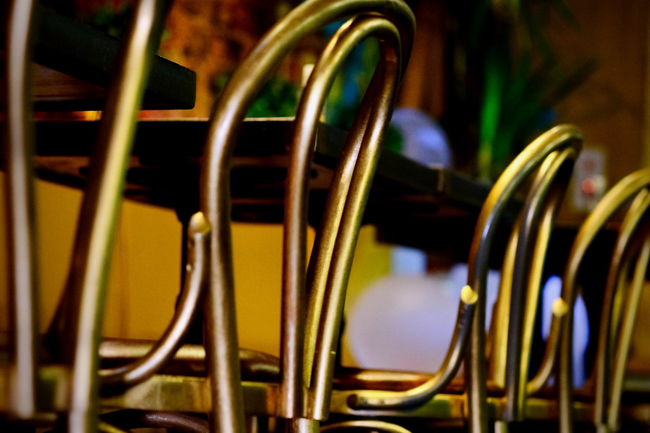
Southern American theme looks are classics for a reason, and it works with our restaurant's theme. The wooden decor look with the Latin-style tables lends a sense of nostalgia while still having a modern Southern American twist.
3 - Community-centred Design
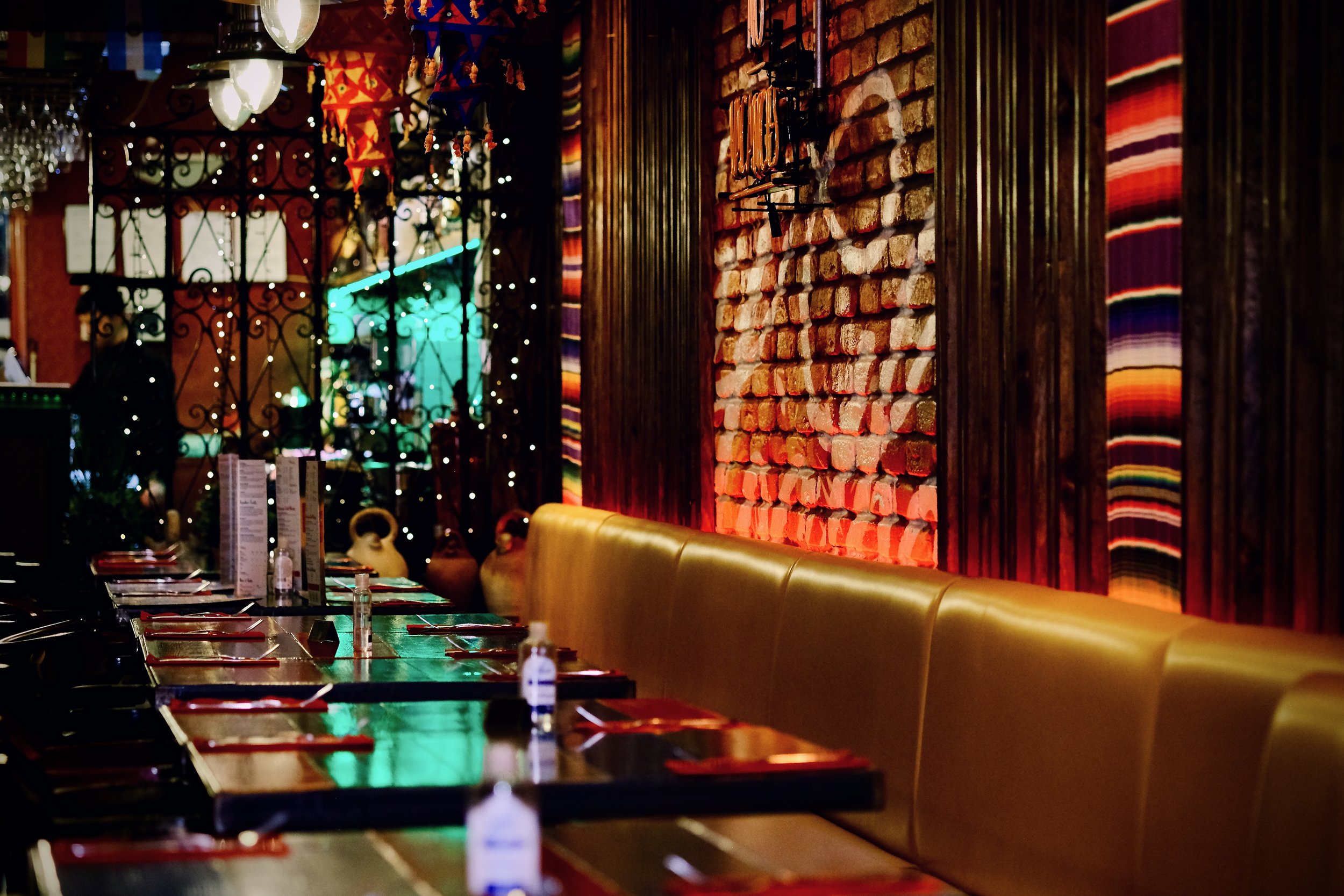
We can't disagree; our delicious food is a great equaliser, but the atmosphere at Vivo Latino brings a community together. To create a community-centred experience in our restaurant, we had to turn single tables into communal tables, remove TVs, and offer board games for guests to play while they wait.
4 - Mindful of Lighting
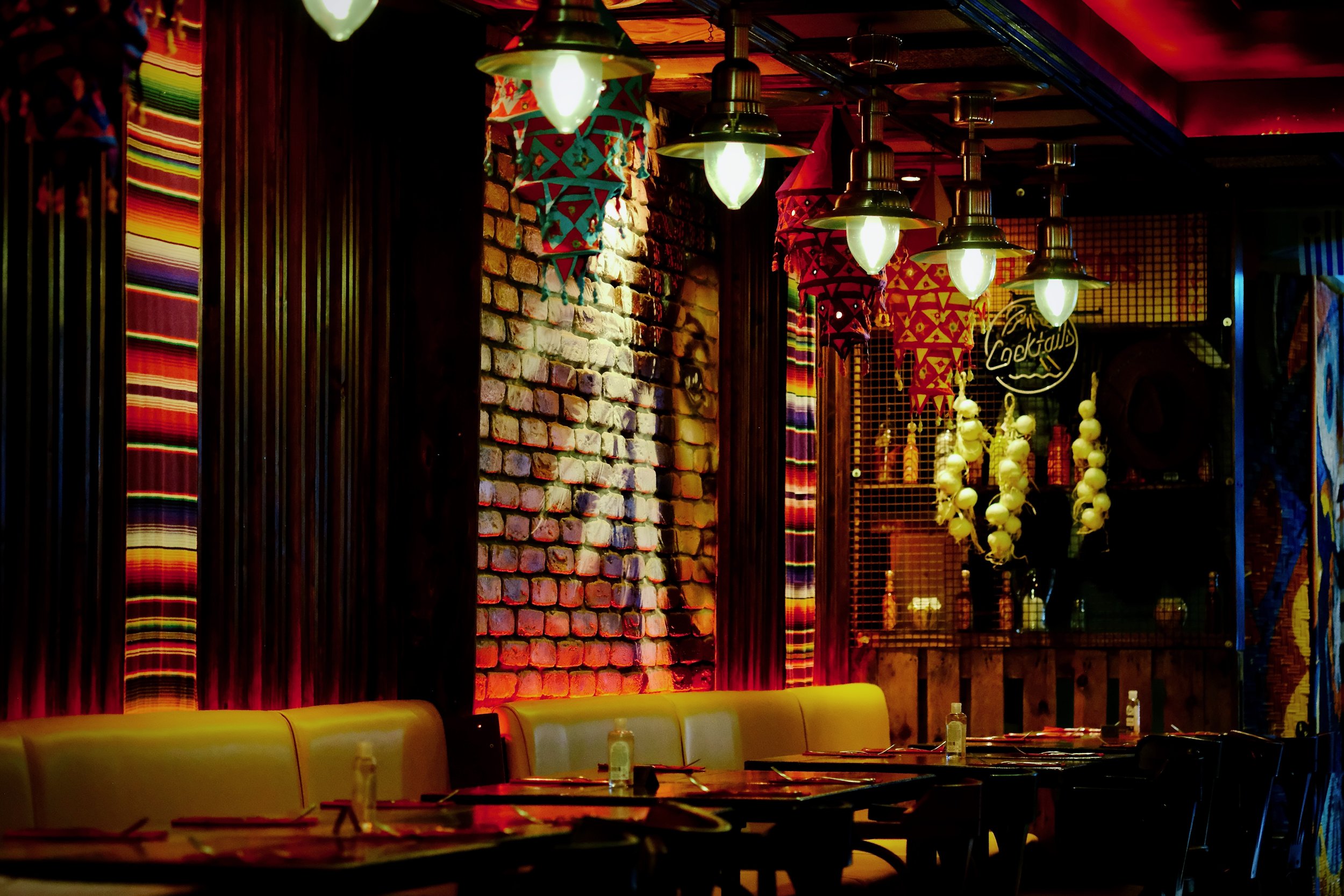
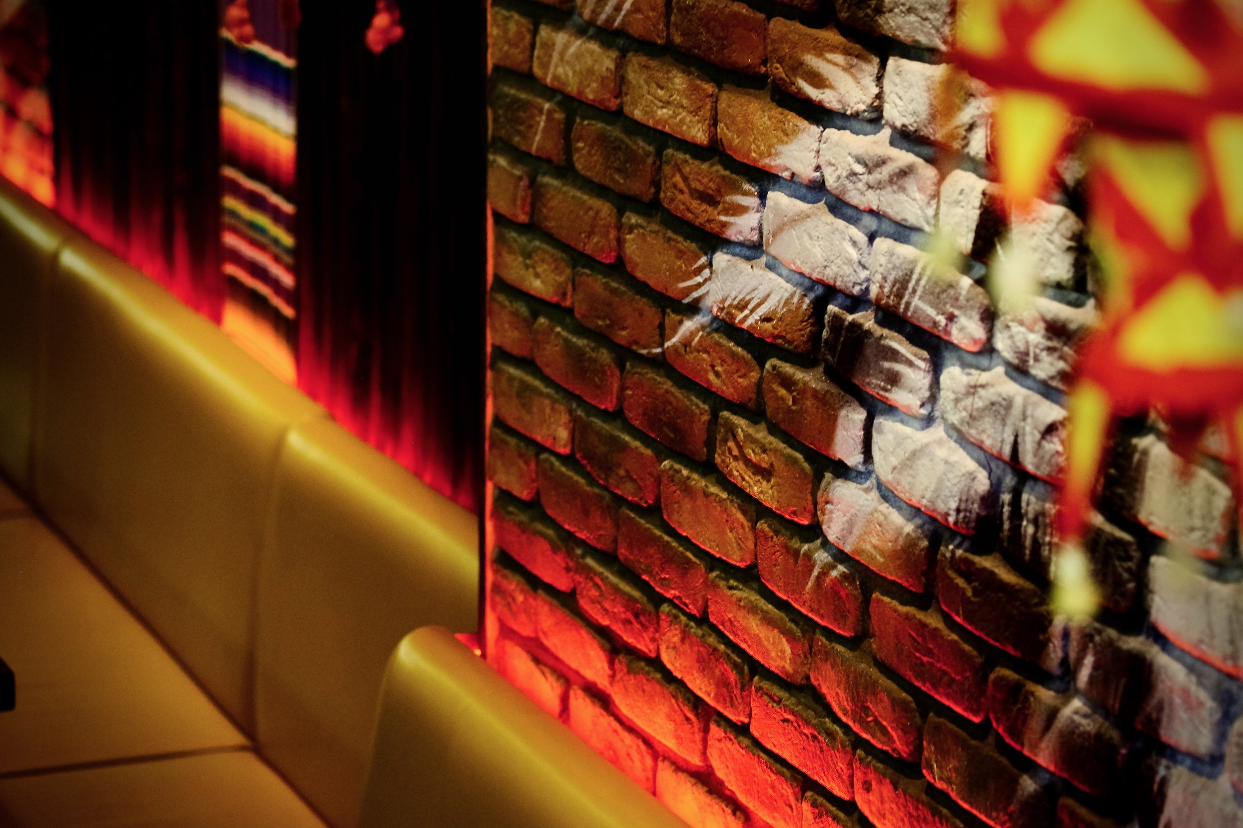
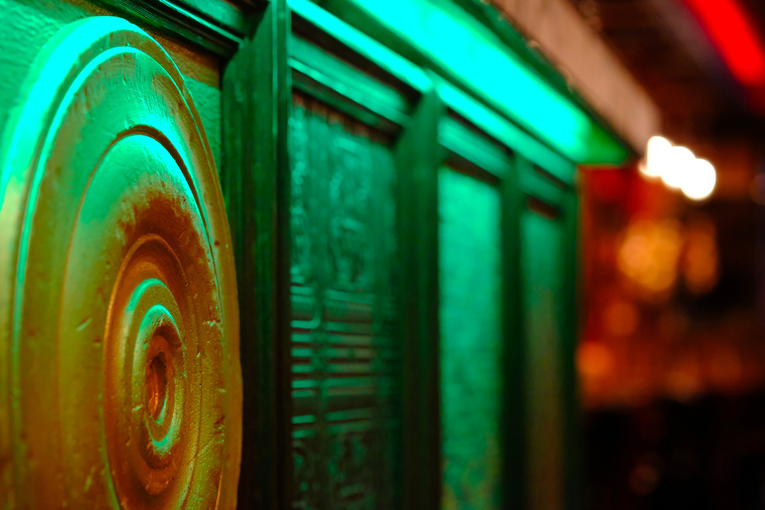
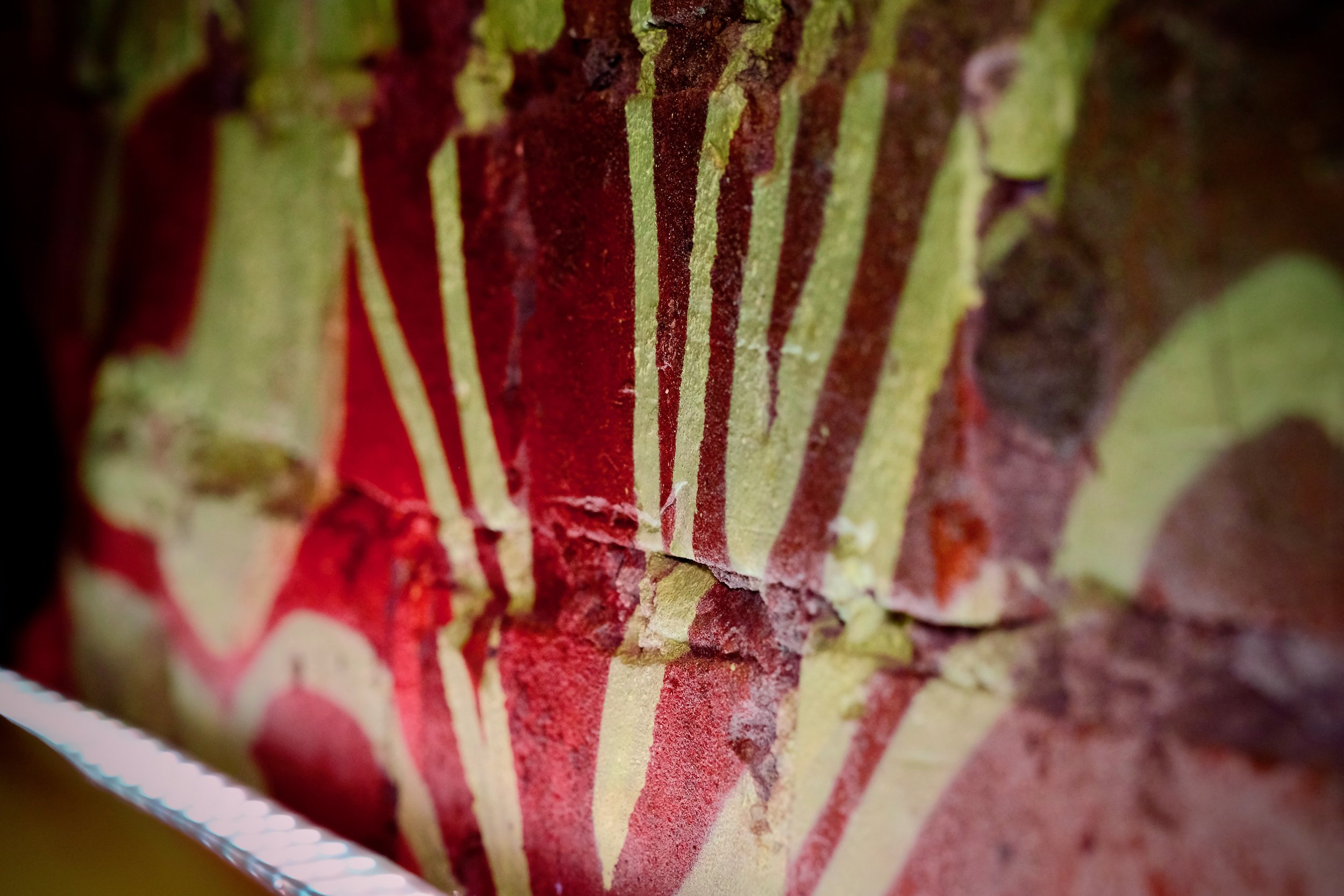
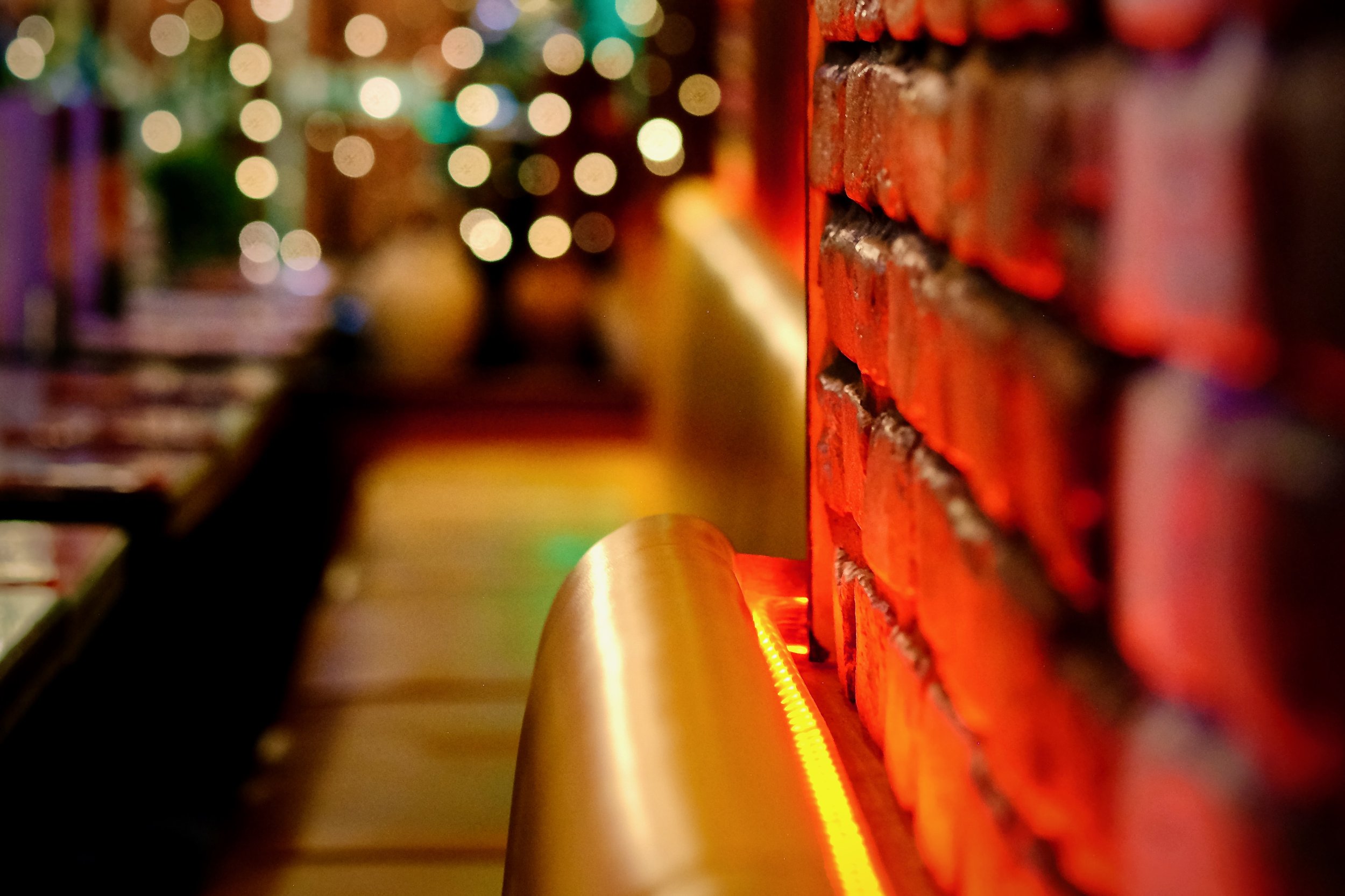
Good lighting creates an ambience for our guests. We've had to think about what type of environment we wanted to make and how we wanted our guests to feel in our restaurant. Besides the feel of Latin America, there were other things to consider when choosing our lighting, e.g. energy efficiency, staff safety, and whether we want customers to be able to get a good shot of their plate for the Instagram.
5 - Typography
When done right, typography as decor is always a hit, and the old-school neon signs are our big hit right now that reflects the vibe of our restaurant.
6 - Going Green

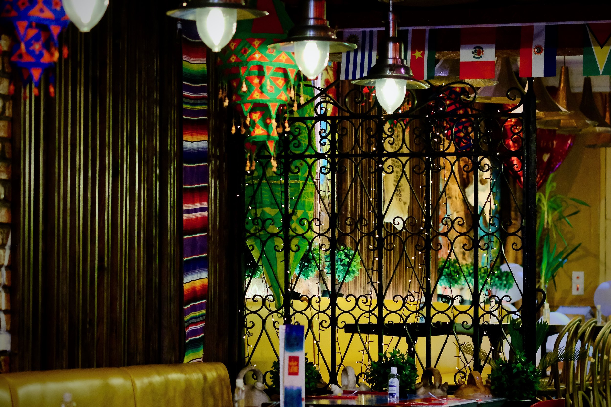
Indoor plants always have a moment, so we decided to decorate our space with lots of greenery. Plants are beautiful and relaxing, and many help purify the air. They also make a visual connection for guests about the freshness of your ingredients.
7 - Supporting Local Artists
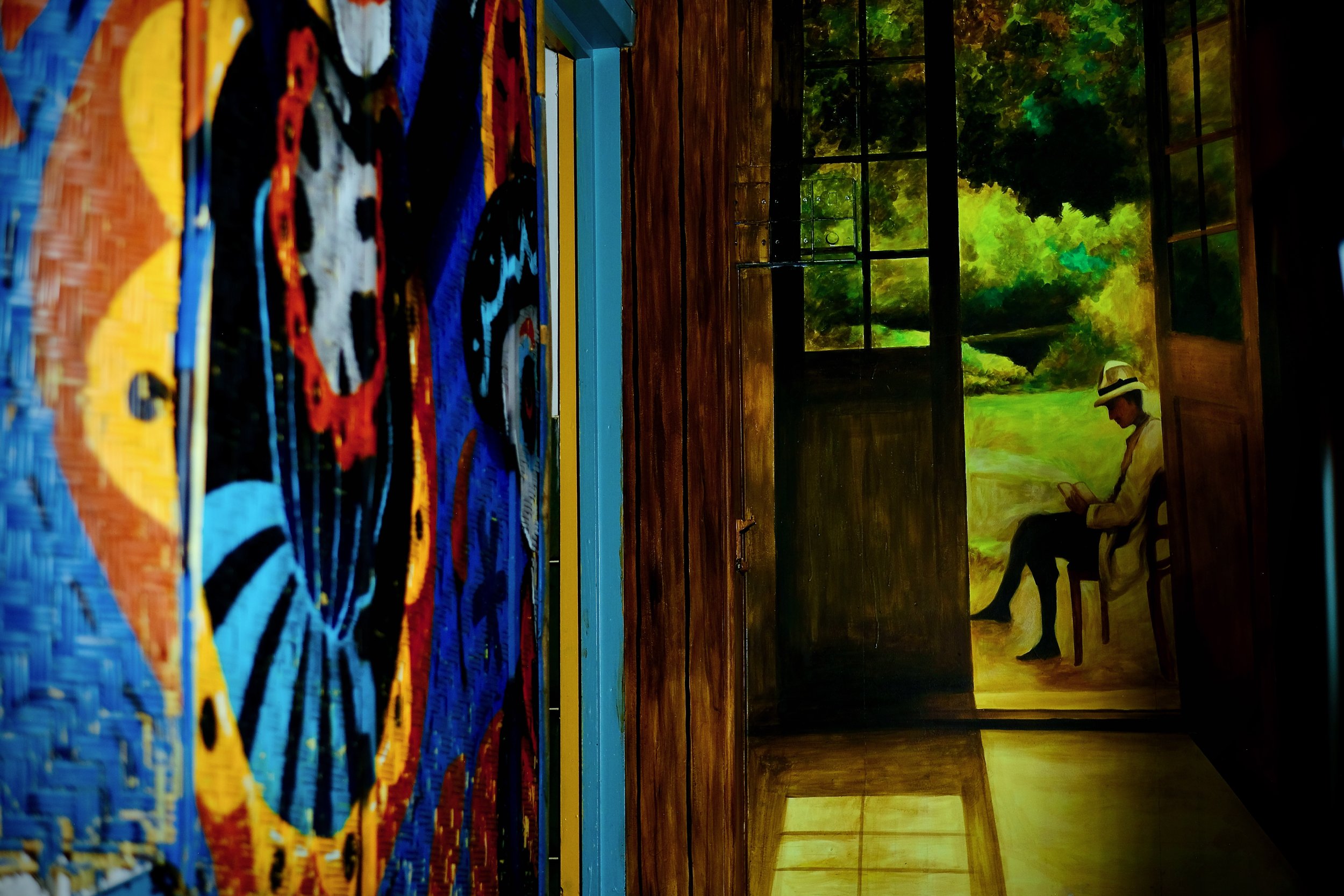
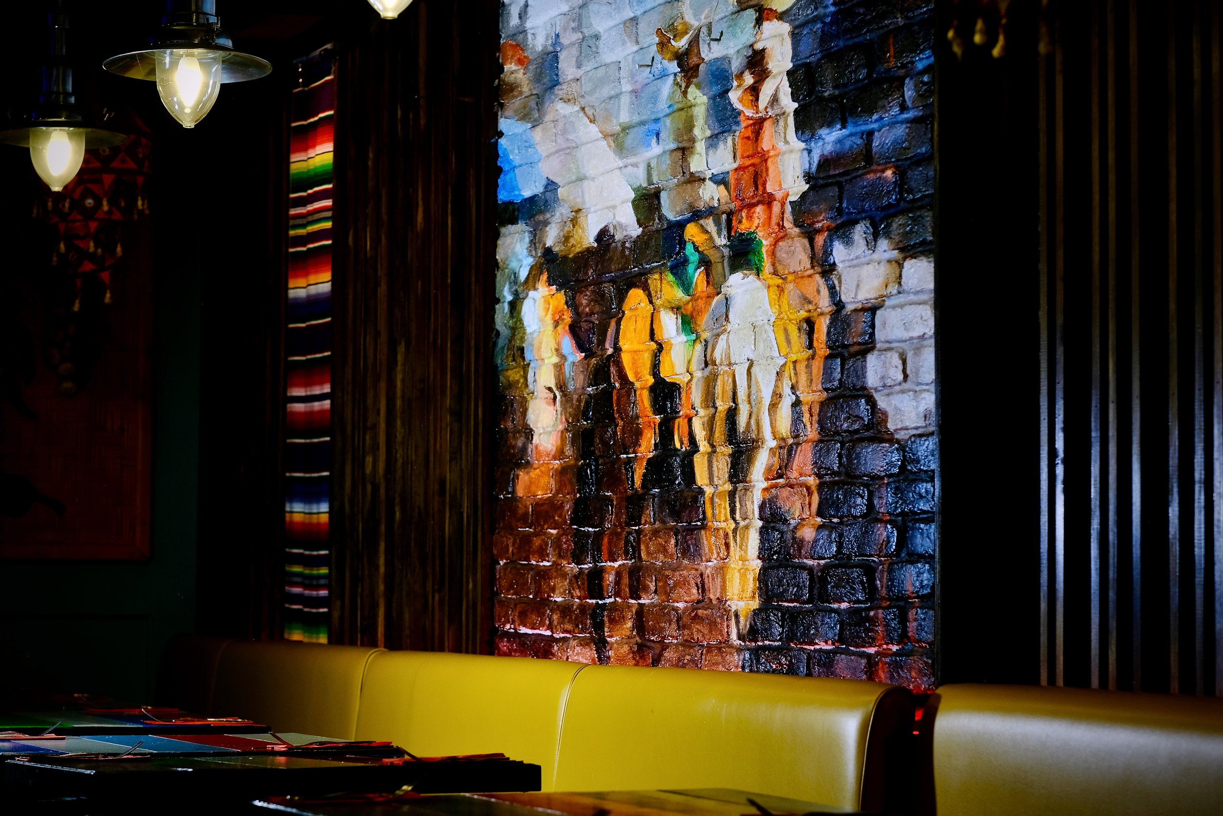
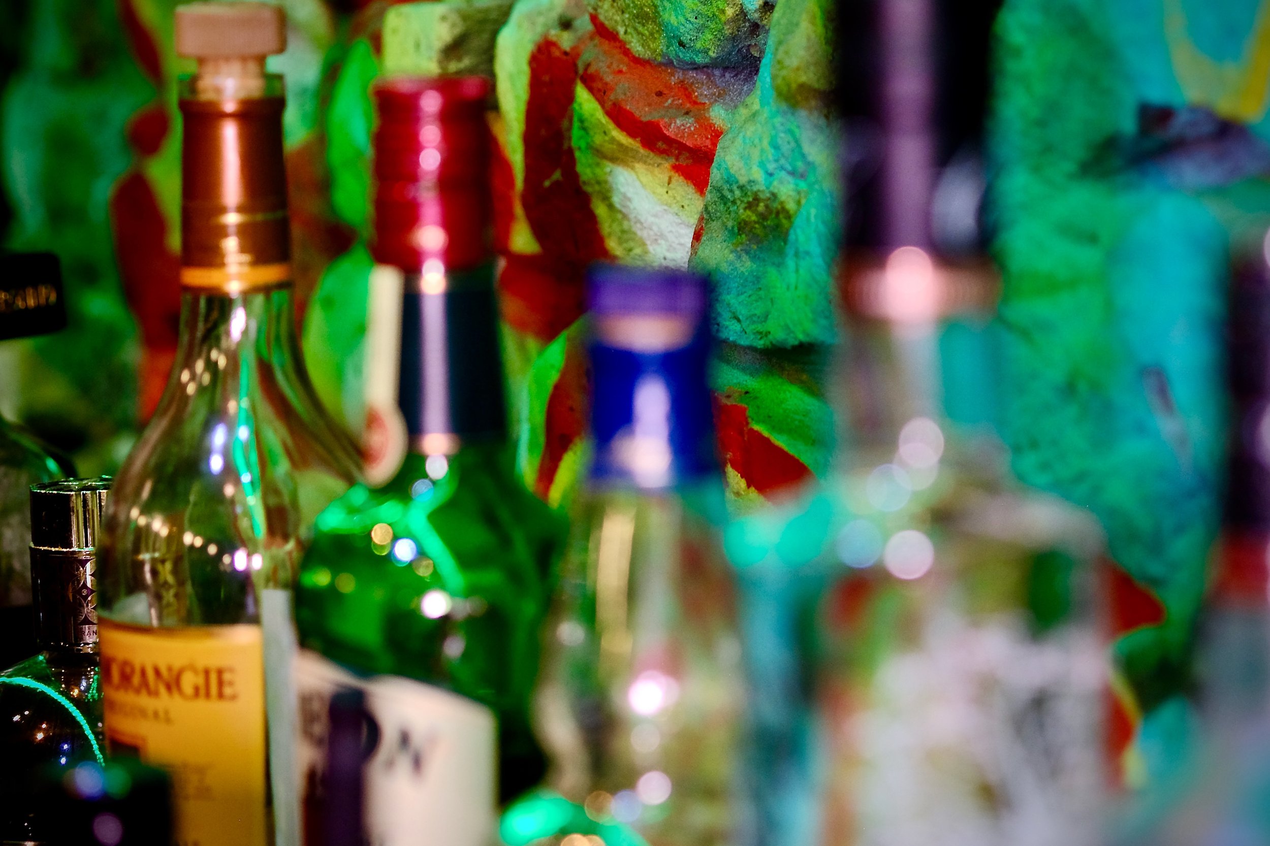
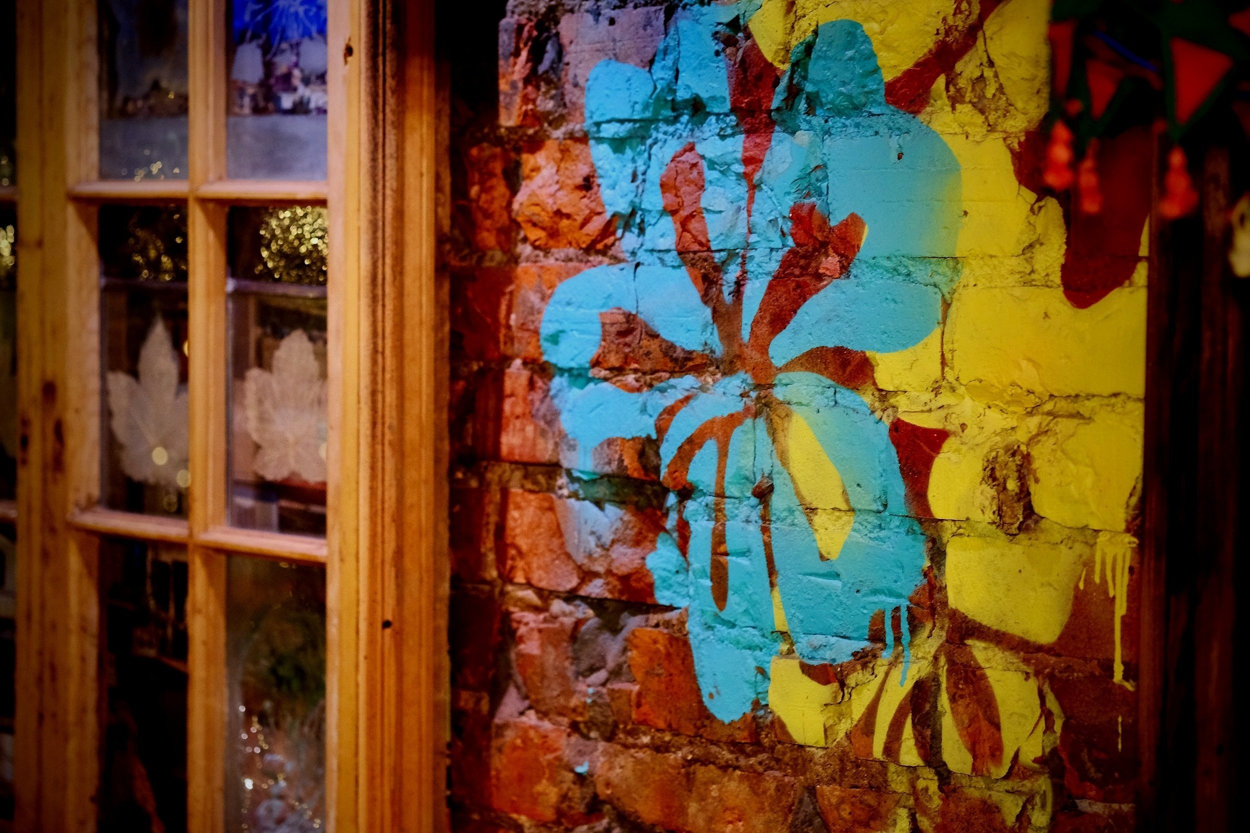
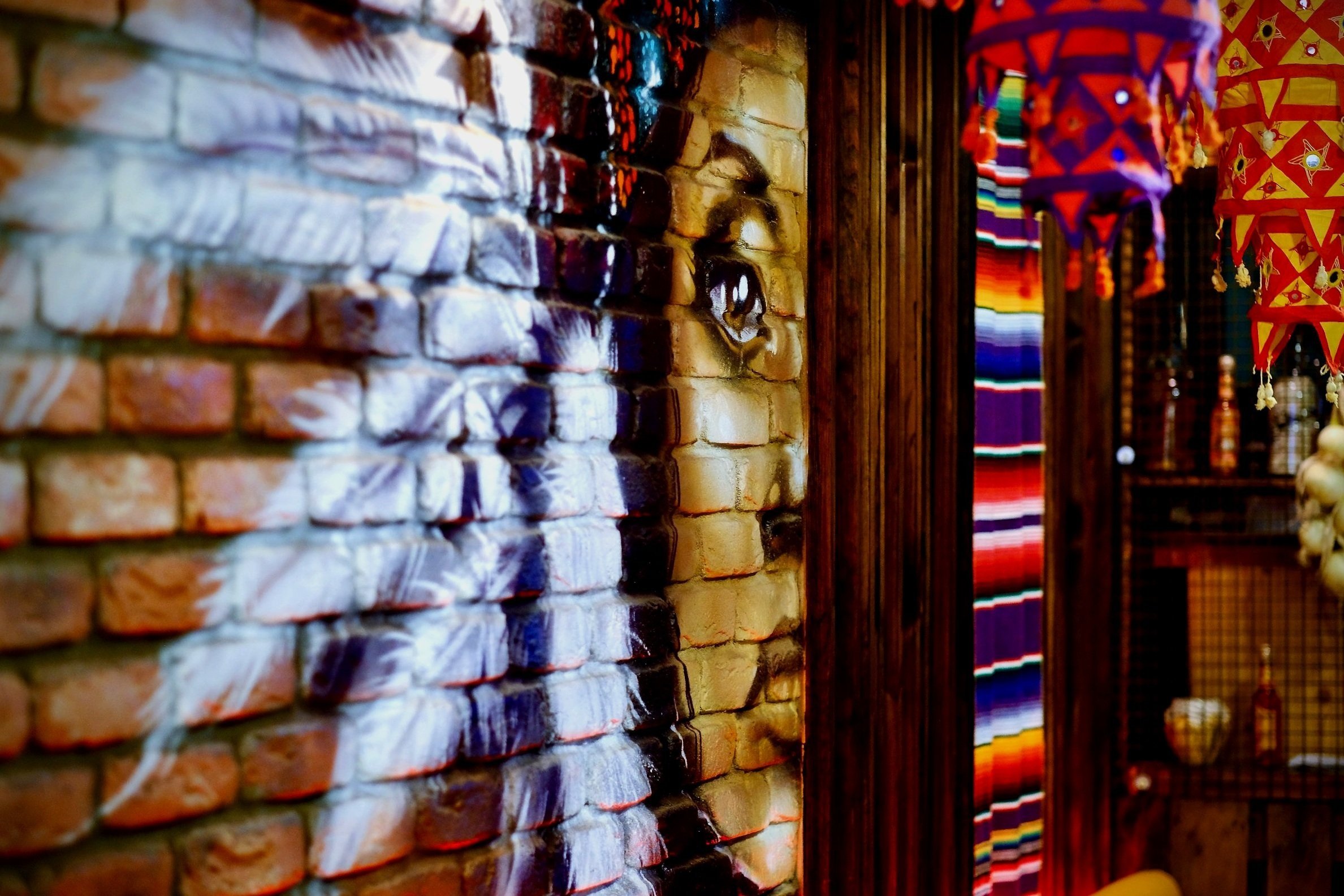
We wanted to showcase a local artist but aren't into the gallery-inspired idea, so we hired an artist whose work we admire to create a mural. Since then, our guests cannot resist a selfie with this Instagram-worthy piece of art. Not to mention - we also put a massive mural on our building's exterior that everyone loves!
Questions / Enquires - enquires@vivolatino.co.uk
